Saturday, 24 October 2009

Advice That Sticks (Article from Creative Review)

I have quoted this article directly from the creative review blog, http://creativereview.co.uk/cr-blog/2009/october/advice-that-sticks. I wonder how much it would cost to make your own tape. It would be cool to have my own tape with contact details, it would act as a kind of business card.


'We're always sending out packages - usually with a magazine or two in them - that require the use of some sturdy sticky tape to ensure the envelopes don't split at the seams. So we will definitely make good use of our new sticky tape - which arrived in the post this morning courtesy of Blanka'.


'The clear sticky tape features words of wisdom from a selection of well-respected graphic designers set in good ol' Akzidenz Grotesk. Designers quoted are Mark Farrow, Michael C. Place, Wim Crouwel, Adrian Shaughnessy, Tony Brook, Ben Stott, Storm Thorgerson, Daniel Eatock and Hamish Muir. "It's based on the principle 'that good advice sticks'," says Blanka's Mark Blamire'.

'The tape was designed by James Greenfield (gradiate.co.uk) and a roll will cost you £7 (including postage) - available from blanka.co.uk'.

Wednesday, 21 October 2009

100 Habits of Successful Graphic Designers

For the ArjoWiggins paper brief I will have a postage pack containing samples of stock and various printing methods. Each sample will contain a design related quote from practicing graphic designers. I managed to scan in a couple of pages of 100 Habits of Successful Graphic Designers containing
interviews and quotations about design.


The Bermuda Triangle Research

"The Bermuda Triangle, also known as the Devil's Triangle, is a region in the western part of the North Atlantic Ocean in which a number of aircraft and surface vessels are alleged to have mysteriously disappeared and cannot be explained as human error, piracy, equipment failure, or natural disasters".

Extract from wikipedia.org


A range of different triangles;

Tuesday, 20 October 2009

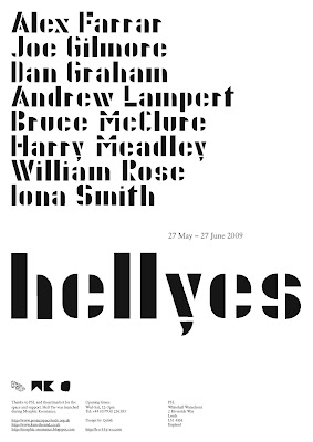
German Luftwaffe Font / Joe Gilmore

I came across the font, Schablonenschrift A though meeting Joe Gilmore who has used it in a number of his freelance work.


Schablonenschrift A is a typeface used by German Luftwaffe during the second world war. It is much more rounded than most stencil fonts, much more intriguing to look at than most.


Hell Yes flyer designed by Joe Gilmore.

Monday, 19 October 2009

Motion Graphics Example 4


Typography Motion Video "conscious", http://www.youtube.com/watch?v=IAVt-TDXq4g&feature=related. This music video is interesting to begin with but I don't see why it has to have flying serif letters travelling across the screen the whole time.


This is the kind of work I want to produce by Philippe Apeloig (http://www.apeloig.com). It integrates typography into motion graphics perfectly. The video above is a screen grab of the animation, to see it (and hear it) properly visit, http://www.apeloig.com/index.php?cle=Echirolles&r=Projets for a better experience.


Motion Graphic Intro Title Sequence - Typography, http://www.youtube.com/watch?v=DNkm-67QfCM

Motion Graphics Example 3

Here are a couple of short video's I pulled off youtube. I like the way there is no sense of an end to each animation. It is as if the graphic can keep on growing irrelevant of space and time.


Wednesday, 14 October 2009

Bureau347 Identity

The identity for Bureau347, a web and graphic design company was designed by Michael C. Place of Build. I want to use simple shapes in order to create letterforms in a similar way to the logotype here. Breaking up the shapes with white lines is a good way of bringing the negative space around the letter to the foreground.


Bureau347' website.

Daam Identity

NB: Studio created an identity for Daam architects and designers. The Daam logo is based on a 1920's Italian typeface whereby all of its letters can be made using various combinations of 20 segments.


Daam website (home page).

Colour Wheel Inspiration

Flicking through What is Graphic Design For? We found and example of an annual report that featured a colour wheel on its front cover. We liked the way all the colours were in a random order as well as being at different sizes.


Mondriaan Foundation annual report 2004.

Double Page Spread Research

For the Leeds Public Arts publication, Kevin and I looked to the layout of the book, Visual Communication from theory to practice. We liked the the relationship between large images and a small amount of body copy. We also wanted to emulate the subtle colour scheme that features throughout the book for our publication.


My own copy of Visual Communication from theory to practice.


Double page spreads from Visual Communication from theory to practice.