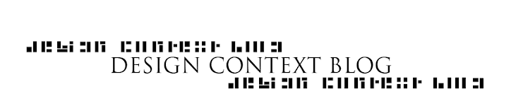
Herman is a typeface designed by London based studio, Julia. It was designed to specifically be used as a guest typeface for the first issue of the magazine, Weird UK. I find the idea of merging a square and circle together to create a set of letterforms intriguing. I tend to stick with straight lines and square shapes when creating my own typefaces - this kind of work gives me the confidence to work with rounded letter forms rather than sticking to rigid right angles.


"Herman is both a display and a text typeface. It looks very different when it is printed in big or small sizes, once the arcs are made of lines designed to print as curves when reduced. While big sizes look square, small sizes print round. It also holds a very decent legibility when used in small sizes" (www.julia.uk.com).


No comments:
Post a Comment