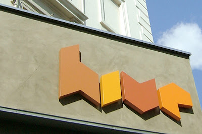
Mind Design worked with Emulsion Architecture to develop the identity for a chain of hair salons called Hive. The identity is based around a bee hive with warm colours and natural materials. I find the designs useful as a reference to my own work because of the experimental nature of the letterforms. Within my own work I try to achieve something that is at times difficult to seek out yet at the same time retains some form of legibility (clean yet messy) which is happening here in these designs.

^ examples of how once you have a basic design in place you can then apply that design to a variety of different media (take note).


No comments:
Post a Comment